Top swing trading stock & ETF picks with Morpheus Trading Group (MTG)

Collapse
X
 
  • Filter
  • Time
  • Show
Clear All
new posts
  • morpheustrading
    Senior Member
    • Sep 2012
    • 131

    Top 3 Reasons Why The NASDAQ Will Soon Breakout To A New High

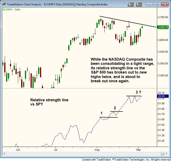
    For the past six weeks, the NASDAQ Composite Index ($COMP) has been uneventfully oscillating in a sideways trading range (a 3% range from the upper channel resistance down to lower channel support).

    However, we have identified three highly reliable technical indicators that point to a strong likelihood of the NASDAQ soon breaking out to a fresh, multi-year high (despite continued weakness in the S&P 500 and Dow Jones).

    1.) The Most Reliable Indicator You Probably Never Use

    We prefer to keep our technical analysis of stocks pretty simple. Although there are literally hundreds of technical indicators at our disposal, we rely primarily on price, volume, support/resistance levels (such as trendlines and moving averages), and the relative strength line.

    The relative strength line is a simple leading indicator that allows us to easily see how a stock or ETF is performing against the benchmark S&P 500 Index ($SPX). This is not to be confused with the RSI indicator (relative strength index).

    When the relative strength line is outperforming the price action of the stock (or the Nasdaq Composite in this case), it is a reliable bullish signal that often precedes further gains in price.

    On the chart below, notice how the relative strength line has already broken out to new highs twice, even though the NASDAQ has been trending sideways to slightly lower. This is a clear sign that institutional funds have been rotating out of the S&P 500 and into the NASDAQ:


    2.) Salute The Bull Flag

    While the relative strength line is one of the most reliable technical indicators to predict future price action, the bull flag is definitely one of our favorite bullish chart patterns to identify and profit from.

    On the longer-term weekly chart, we clearly see the Nasdaq has been forming a bull flag chart pattern. This is annotated by the black lines we have drawn on the chart below:


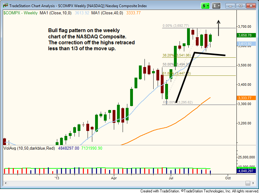
    Notice that the rally off the lows in July created the flag pole part of the bull flag pattern, while the current sideways price action forms the flag.

    The tight consolidation of the past six weeks has retraced less than one-third of the last wave up. This is what we like to see, as the best-formed bull flag patterns should not pull back to more than a 38.2% Fibonacci retracement of last move up.

    Finally, since the flag pole and the flag are frequently symmetrical in time, we need to compare how long it took for the pole to form with the length of the flag.

    Since the pole was created over the span of six weeks, the anticipated breakout from the bull flag pattern should occur after the flag has formed for 5-7 weeks (we are currently on week 5).

    3.) Already Leading The Market Higher

    When I began trading and studying technical analysis many years ago, I assumed that the main stock market indexes (such as the NASDAQ) led the way for the top-performing stocks to move higher.

    I was definitely wrong.

    The reality is the opposite situation; leading individual stocks set the pace for the broad market to follow.

    When the strongest stocks in the market (typically small to mid-cap growth stocks) are convincingly breaking out to new highs ahead of the broad-based indexes, it is a very bullish sign and the main stock market indexes usually follow suit.

    Conversely, it is a bearish signal when the major indices are trending higher, but without clear leadership among individual stocks.

    Right now, there is a plethora of stocks that are breaking out to new highs ahead of the NASDAQ.

    In no particular order, here are the ticker symbols of a handful of stocks breaking out right now, or have already broken out, to new highs: $QIHU, $LNKD, $TSLA, $NFLX, $KORS, $LOCK, and $YELP.

    We are presently long four of the above stocks in our Wagner Daily newsletter, and with the following unrealized gains since our original buy entries (based on Sept. 6 closing prices): YELP +23.2%, LNKD +10.0%, LOCK +9.1%, and KORS +7.1%.

    In case you missed it, you may want to check out our original August 21 analysis of Yelp ($YELP) (before it broke out and zoomed higher over the past few days).

    Death And Taxes – The Only Sure Things

    As my grandmother loved to tell me, “the only sure things in life are death and taxes.” I agree, especially when it comes to the stock market.

    Obviously, the Nasdaq has not yet broken out, and there is no guarantee that it will.

    Nevertheless, the combination of the three reliable technical indicators above suggest a strong likelihood that the tech-heavy index will soon break out of its range and cruise to a new, multi-year high (though the S&P and Dow are another story).

    If the Nasdaq suddenly rallies to new highs as anticipated, are you prepared to take advantage of the move? Do you know which stocks will offer the best odds for high profits? Be prepared.

    Comment

    • morpheustrading
      Senior Member
      • Sep 2012
      • 131

      How To Buy Top Breakout Stocks On A Pullback

      On August 21, 2013, we bought Yelp, Inc. ($YELP) in The Wagner Daily newsletter, as it pulled back to near-term support after a massive breakout.

      Since then, shares of $YELP have zoomed to an unrealized share price gain of 24.8% (from our entry point through the close of September 10), and we continue to hold the stock in anticipation of further gains.

      In the educational 5-minute swing trading strategy video below, we walk you step-by-step through the objective technical analysis that prompted us to buy $YELP, currently one of the strongest stocks in the NASDAQ.

      Specifically, you will learn a low-risk way to buy a stock that forms a bullish reversal pattern after pulling back to near-term support of its 20-day exponential moving average.

      For best viewing quality, play the video below in full-screen HD mode. After playback begins, just click the icon on bottom right side of the video player window:

      Comment

      • morpheustrading
        Senior Member
        • Sep 2012
        • 131

        How We Bought A Pullback In LifeLock ($LOCK) For A 15% Gain…So Far

        On August 13, we bought shares of LifeLock ($LOCK) with a $12.37 entry price. Since then, $LOCK has climbed to an unrealized price gain of approximately 15% since our buy entry (over a 4-week holding period).

        In today's stock trading strategy video, we show you the exact technical signals that alerted us to buy $LOCK on a pullback, just a few days after the stock broke out from a bullish cup and handle chart pattern.

        As you will learn in the video, the key point in buying the pullback of a stock that has already broken out is to look for a retracement to the 10-day moving average, then buy the first move above that that day's high.

        Sometimes, especially when the broad market is taking a rest, a stock will pull back further than the 10-day moving average (to the 20-day moving average), but the swing trade setup is still valid if the stock quickly snaps back.

        Click the link below to view the 3-minute video:

        Comment

        • morpheustrading
          Senior Member
          • Sep 2012
          • 131

          Don’t Miss The Breakouts In These Top 2 Relative Strength Stocks

          The stock market remains in pullback mode after a strong surge off the lows, but leading individual stocks continue to hold up and show clear relative strength.

          Yesterday, for example, 4 of the 11 stocks in our swing trade newsletter gained at least 1.5%, even though the NASDAQ Composite was flat.

          Yelp ($YELP), which is presently showing an unrealized price gain of 33% since our August 21 buy entry, jumped 2.4% yesterday. LinkedIn ($LNKD), another leading stock we are currently holding, climbed 2.6%.

          As long as the broad market avoids heavy distribution and leadership stocks continue holding above key support levels, we expect the current correction to be short lived.

          As such, our market timing system remains in “Buy” mode and we continue to establish new long positions in leading stocks and ETFs.

          A 3-D Printing Stock And Biotech Stock – What Could They Have In Common?

          Going into today, there are two new swing trade buy setups on our Wagner Daily watchlist: Ambarella ($AMBA) and Organova Holdings ($ONVO).

          Although $AMBA is a biotech stock and $ONVO is in the exciting industry of 3-D printing, the common factor both stocks share is a very high IBD Relative Strength (RS) rating.

          $AMBA has an RS rating of 94, while the RS rating of $ONVO is 98 (99 is the absolute best).

          Since high RS is one of the top technical criteria in the individual stocks we look to trade, both stocks pass that test with flying colors.

          Ambarella ($AMBA)

          In addition to having high relative strength, $AMBA has a 5-year growth rate of a whopping 53%. Combined with high RS, the high EPS rate makes $AMBA an ideal buy candidate.

          Let’s take a look at the daily chart of $AMBA below:


          After rallying more than 300% since its IPO just over a year ago, $AMBA entered into a correction throughout July and August that caused the biotech stock to slip below intermediate-term support of its 50-day moving average.

          However, notice that $AMBA reclaimed its 50-day moving average earlier this month, and did so on a big jump in volume. This is a very bullish sign that indicates $AMBA is setting up for another rally higher.

          Organova Holdings ($ONVO)

          In July of this year, $ONVO surged to the $8 level and volume correspondingly spiked higher as well.

          After peaking near $8 this past summer, $ONVO pulled back to the $5 area, which caused a “higher low” to form (above the August low near $4.50). Since then, the stock has been in consolidation mode.

          On September 19, $ONVO recaptured its 10-week moving average (similar to 50-day moving average) on heavier than average volume, then consolidated on lighter volume for two days.

          Now, we are looking for the price action to tighten up around the 10-week moving average, which could soon lead to a breakout above the range:


          Because of their relative strength, combined with their bullish consolidation patterns, both $AMBA and $ONVO have entered our radar screen for potential buy entry in the coming days.

          Regular subscribers of our swing trading newsletter should note the “Watchlist” section of today’s report for our exact entry, stop, and target prices for each of these two new swing trade setups.

          Comment

          • morpheustrading
            Senior Member
            • Sep 2012
            • 131

            Yesterday’s (October 8th) selloff was broad-based and ugly, with just about every industry sector getting hit hard (utilities were an exception).

            The NASDAQ Composite ($COMP) and small-cap Russell 2000 Index ($RUT), the leading market averages in recent months, were hit the hardest with losses of -2.0% and -1.7% respectively.

            The NASDAQ is now the only index still trading above the 50-day moving average (but not by much).

            Individual leadership stocks, typically small to mid-cap stocks with a strong history and outlook of earnings growth, were hit hard as well.

            Whenever the major indices undergo a price correction, one of the most important factors we analyze is how well leading stocks hold up and show relative strength to the broad market.

            So, where does this leave us as we enter the new week?

            How To Know When The Tide Is Turning

            If leading stocks show relative strength by mostly ignoring weakness in the S&P, Dow, and NASDAQ during broad-based price corrections, it’s a positive sign that tells us it’s safe to carry on entering new trades of these leading growth stocks, the best stocks to buy in a healthy market.

            However, when top stocks begin succumbing to the weight of the broad market’s downward pressure, it quickly grabs our attention and tells us it’s time to lay off the gas pedal and take a more proactive stance with regard to managing existing positions for maximum profits and minimal losses.

            So, Is The Tide Turning?

            Yesterday, market leader LinkedIn Corporation ($LNKD) sliced through key support of its 50-day moving average on volume that surged to roughly 300% its average daily level. This volume spike tells us banks, hedge funds, mutual funds, and other institutions were driving the selling. Not a good sign for bulls.

            Other leading stocks that sold off on heavy volume yesterday included: Qihoo 360 Technology ($QIHU), Vipshop Holdings ($VIPS), Soufun Holdings ($SFUN), Pandora Media ($P), Mercadolibre ($MELI), Priceline.com ($PCLN), and Amazon.com ($AMZN).

            Although $PCLN and $AMZN had a rough day, both stocks are still trading above their respective 50-day moving averages (an intermediate-term “line in the sand” for many retail and institutional traders/investors).

            Balancing On The Cliff

            The broad market rally is just barely hanging on. If leading stocks begin cracking below their 50-day moving averages en masse, our proprietary Market Timing Model will be forced to shift from “buy” to “sell” mode.

            If you’re new to the role that market timing rules play into our overall ETF and stock picking selection, please click here to learn the general concept of our system for market timing, then check out this article that explains the five, rule-based modes of our model for timing the stock market.

            Keeping On Our Toes

            Yesterday was a busy day for subscribers of The Wagner Daily, our nightly swing trading newsletter (which includes access to our market timing methodology).

            On the individual stock side, we sold Bitauto ($BITA) and LifeLock ($LOCK) for decent share price gains of 36.7% and 13.8% respectively. LinkedIn ($LNKD) hit our stop and we sold for an average loss of just 2.7%.

            As for the ETF side, we sold two existing ETF trades yesterday to minimize losses. On SPDR Biotech ($XBI) and Direxion Small-Cap Bull 3x ($TNA), we lost 3.6% and 6.3% respectively. However, these losses were much smaller than the 44% gain we secured in Guggenheim Solar ETF ($TAN) last week (check back on this blog for an educational technical review of this $TAN trade by the end of this week.

            How To Be Profitable In A Reversing Market? Simple Math

            Many traders, particularly newbies, are obsessed with the accuracy of win rates (percentage of winning trades vs. losing trades) when analyzing how well a trading system is likely to perform over the long-term.

            However, the reality is that a trader’s long-term profitability depends largely on other factors, such as the dollar amount of the average winning trade compared to the dollar amount of the average losing trade.

            If, for example, a trader has a win rate of 70%, but allows their average losing trade to be 300% larger than their average winning trade, he/she will be net negative over the long-term.

            Conversely, if a trader has a win rate of just 50%, but allows the average winning trades to ride to being just double (200%) the size of an average losing trade, the trader will become net profitable over the long-term.

            Lately, we’ve been closing our swing trades with about a 50% win rate (maybe even slightly lower), but our average gain has been MUCH larger than the average loser.

            With the three stock trades we closed yesterday ($BITA, $LOCK, and $LNKD), our average winner was a share price gain of 25.3%, while the sole losing trade was just 2.7%.

            That makes for a whopping reward-risk ratio of more than 9 to 1 (anything ratio above 3 to 1 is generally considered to be quite good).

            Comment

            • morpheustrading
              Senior Member
              • Sep 2012
              • 131

              A great example of why PATIENCE PAYS when holding winning stocks...

              Click image for larger version

Name:	SLCA.jpg
Views:	1
Size:	22.1 KB
ID:	189383

              Always hold your winners until the price action gives you a reason not to (but ditch those losers quickly when they hit your stop).

              Comment

              • morpheustrading
                Senior Member
                • Sep 2012
                • 131

                How Top Stock Traders Mentally Deal With Sudden Market Reversals

                After suffering a nasty, two-day decline on October 8 and 9, the stock market ripped higher on October 10, closing the day with massive gains of more than 2% across the board.

                Feeling a bit of whiplash lately?

                While the big gains with bullish closing action on October 10 were a positive sign for the market, that powerful and sudden reversal immediately put traders who just stopped out of stock trades into regret mode, one of the Four Most Dangerous Emotions For Traders.

                Driving A Car While Staring In The Rear-View Mirror Is Hazardous To Your Health

                Regardless of whether or not you sold your stocks at lower prices and are now feeling regret, let’s get one thing straight…

                This is not the time to be worrying about what happened in the past because you must be focused on what is happening NOW!

                Whenever traders mentally struggle over whether or not they made a correct trading decision, such as if they bought or sold at the right time, they will often be wrong…but that’s completely okay!

                What is not okay is to STAY wrong! If you’re wrong, simply move along.

                During the whipsaw action of October 8-10, you may have found yourself stopped out of a stock position that subsequently made an abrupt u-turn and once again looks to be in good shape.

                If this happened to you, the correct thing to do is to calmly and objectively jump back into the trade (even if you need to reduce your share size a bit to make that happen).

                The current daily chart of Michael Kors ($KORS) is a good example of a stock that can be re-entered, even if the trader was recently forced to sell:

                Click image for larger version

Name:	KORS.jpg
Views:	1
Size:	18.7 KB
ID:	189384

                When $KORS sliced through key support of its 50-day moving average on October 8, it undoubtedly triggered many sell stops (which was the correct thing to do).

                However, just two days later, $KORS jumped back above support of 20 and 50-day moving averages, and back into its prior range.

                As long as $KORS holds the newly reclaimed support levels, it is valid to re-enter the stock (regardless of one’s previous outcome in the trade).

                Remember that each new trade entry is completely independent of itself.

                Furthermore, we have learned over the years that trade re-entries (after stopping out because we bought too early) are often the most profitable trades because the “shakeout” absorbs overhead supply that would have otherwise created additional resistance on the way back up.

                Just one note of caution, though, with regard to re-entering trades: Don’t confuse re-entering a bullish stock with “revenge trading,” which occurs when a trader re-enters a stock that fell apart, but still has not shown a valid technical reason to get back in (ego, be damned).

                Now What?

                Yesterday’s strong gap up was certainly a bullish sign, and we could see a solid, broad-based rally develop if the recent lows in the major averages hold up.

                Unfortunately, yesterday’s volume was lighter in both exchanges, meaning the rally was not led by banks, mutual funds, hedge funds, and other institutions.

                Nevertheless, with so many stocks changing hands the past few days, it’s quite apparent that buyers were stepping in to accumulate leading stocks off the lows. Just check out the charts of $LNKD, $KORS, and $TSLA to see what we mean.

                Although we reduced our long exposure on October 8, our remaining stock positions are still in pretty good shape.

                U.S. Silica Holdings ($SLCA), for example, has shown incredible relative strength over the past few days, as the stock basically ignored the October 8 sell-off.

                Below is an annotated chart of $SLCA that we recently posted on our new Google+ page:

                Click image for larger version

Name:	SLCA.jpg
Views:	1
Size:	23.8 KB
ID:	189385

                When a stock breaks out with strong price and volume action, it is always a very bullish sign. In fact, price and volume are the two most important and powerful technical indicators at a trader’s disposal.

                We all have the urge to lock in profits at times, but to make the big money in trading, one’s focus must simply be on consistently doing the right thing.

                If a trader does so, the large profits will eventually follow.

                Overall, we feel that $LNKD, $KORS, $YELP, and $TSLA are the top dogs in this market right now, and are “must own” stocks for institutions.

                As of now, we view the recent shakeout action as a buying opportunity (with stops placed beneath that week’s lows).

                Either the lows of October 8 and 9 hold up, or the market will end up going much lower over the next few months.

                As always, remember to trade what you see, not what you think!

                Comment

                • morpheustrading
                  Senior Member
                  • Sep 2012
                  • 131

                  4 Winning Tips For Profitable ETF Trading

                  On July 2 of this year, we bought Guggenheim Solar Energy ETF ($TAN) in our swing trading newsletter. Three months later, we sold those shares of $TAN for a cool price gain of 44.3%.

                  In this trading strategy article, we detail the top 4 technical tips that prompted us to buy $TAN when we did.

                  Then, we walk you through to the day when we eventually exited the trade to lock in the profits.

                  Here’s a snapshot of how the daily chart of $TAN appeared at the time of our initial trade entry. The 4 reasons we bought this ETF immediately follow:

                  Click image for larger version

Name:	tan1.jpg
Views:	1
Size:	18.4 KB
ID:	189386

                  4 Big Tips For ETF Traders

                  1.) Sector Relative Strength - As detailed in my first ETF book, one of the first steps of my ETF trading strategy is to identify the industry sector showing the most relative strength to the benchmark S&P 500 Index. In early May, the relative strength of the solar energy sector became very apparent to us, prompting us to add $TAN to our watchlist for potential trade entry.

                  2.) Uptrend Confirmed - When a stock or ETF breaks out to the upside, we have a basic trend qualifier that we utilize in order to confirm a valid uptrend is in place before tending to buy the stock. Specifically, the 20-day exponential moving average must be above the 50-day moving average, and 50-day MA must be above the 200-day MA. Additionally, all three moving averages must be trending upwards. Although $TAN initially pushed above its 50-day MA back on April 8 (the big green bar accompanied by the volume spike), it wasn’t until mid-May that $TAN met our trend qualifier requirement.

                  3.) Big Volume Breakout - The best breakouts are always accompanied by increasing volume in which turnover spikes to 2 to 3 times its average daily level. After mid-May, when bullish momentum really started pushing tan higher, notice how volume picked up as well. Such volume spikes are like stepping on the gas pedal for a breakout, and help to confirm the legitimacy of a breakout as well. Unlike other technical indicators that frequently give false readings, volume is the one indicator that never lies.

                  4.) First pullback to 50-day MA - Because of the relative strength in the solar energy sector, the high volume breakout, and the trend qualifier requirement being fulfilled, we knew we had to buy $TAN. It then became a matter of simply waiting for a proper, low-risk entry point. Rather than chasing the price of the ETF after the initial breakout, we simply waited for a pullback that would give us a low-risk buy entry point. Specifically, we were looking for an “undercut” of the 20-day EMA, or even a pullback to more significant support of the 50-day MA. After zooming to the $28 area, $TAN entered into a 4-week base of consolidation, then dipped to “undercut” key support of its 50-day MA for one day before heading right back up. Whenever a stock or ETF breaks out on big volume and leads the market, the first touch of the 50-day MA usually leads to a resumption of the new uptrend because many institutions (“smart money”) use the 50-day MA as an indicator for when to begin accumulating leading stocks and ETFs on a pullback. After $TAN successfully tested support of its 50-day MA, it would’ve been a valid buy entry the following day, when the price moved above that day’s high. However, we prefered to wait for the confirmation of the break of the 6-week downtrend line that formed off the highs of May. That downtrend line breakout occurred on July 1, and we bought the following day at a price of $24.20.

                  So, What Happened Next?

                  Below is a snapshot of the price action that followed our July 2 buy entry into $TAN:

                  Click image for larger version

Name:	tan2.jpg
Views:	1
Size:	18.4 KB
ID:	189387

                  After our initial buy entry on July 2, $TAN acted as anticipated by subsequently cruising to a new high less than two weeks later.

                  Thereafter, $TAN appeared to be forming a bull flag chart pattern, which prompted us to add to the position on July 22 (at $27.91).

                  However, since the bull flag pattern did not follow-through to the upside, we maintained a very tight stop on the additional shares, which we closed for a tiny loss of 1.6% on August 2.

                  After chopping around in a range for a few weeks, and again coming into support of its 50-day moving average several times, $TAN eventually broke out to new highs again.

                  As we frequently remind traders, one important psychological aspect of profitable trading is having the discipline and willingness to quickly close out losing trades when you’re wrong, while still not being afraid to re-enter the trade if it still looks good.

                  As such, we again bought additional shares of $TAN when it broke out on September 6 (bear in mind that we still held the initial position from our July 2 entry because those shares never went against us).

                  Click image for larger version

Name:	tan3.jpg
Views:	1
Size:	18.0 KB
ID:	189388

                  After buying the breakout to new highs in early September, $TAN consolidated for a few more weeks, then ripped higher as volume began surging higher again.

                  Rather than attempting to guess when a powerful rally will end, we often close winning trades by trailing protective stops tighter and tighter, until a pullback eventually causes us to lock in the profits.

                  But in the case of $TAN, we instead made the decision to sell into strength of the rally due to prior resistance from back in February 2012 (visible on a weekly chart).

                  Upon selling $TAN on October 1, the final tally was a 44.3% share price gain from our initial July 2 entry, and a 15.4% gain from our September 6 buy entry.

                  Is 44% A Big Gain For An ETF Trade?

                  When trading individual stocks, we typically shoot for an average price gain of 20 to 30% for short to intermediate-term momentum trades.

                  Sometimes, bullish momentum propels stocks with massive relative strength 40 to 50% higher before we eventually sell and take profits. For example, in our Wagner Daily ETF and stock picking portfolio, we are presently sitting on unrealized gains of 49% in Silica ($SLCA) and 35% in Yelp ($YELP).

                  On October 8, we also closed a swing trade in Bitauto ($BITA) for a price gain of 36.7% with just a 1-month holding period.

                  However, because they are comprised of a basket of actual stocks, ETFs are generally much less volatile than the individual small to mid-cap growth stocks we trade in bull markets.

                  As such, we consider a solid gain for an ETF swing trade to be in the neighborhood of 10 to 15%, rather than 20 to 30%.

                  In addition to the various leveraged ETFs, $TAN is one of the few non-leveraged ETFs that trades with the volatility of a typical small to mid-cap stock.

                  That’s why we managed to snag a 44.3% gain by trading $TAN, despite it being an ETF.

                  In between, there was just a tiny 1.6% loss from our bull flag entry attempt on July 22.

                  You can screw up a lot of things in trading, but still be profitable if you consistently get just one thing right:
                  Let the profits ride when you’re right, but get the hell outta’ Dodge when you’re wrong!

                  Comment

                  • morpheustrading
                    Senior Member
                    • Sep 2012
                    • 131

                    How To Avoid The Biggest Mistake Traders Make In A Bull Market

                    After the October 17 breakouts to new highs in the S&P 500 and NASDAQ Composite, I got to thinking about bull markets.

                    I was pondering over how much traders and investors must be loving and profiting from this powerful rally stocks have had in 2013.

                    But then a worrying thought popped into my head.

                    It occurred to me it’s quite possible that not all traders and investors have actually been raking in the trading profits, despite the major indices being at new highs.

                    Why? Because I fear that many traders and investors have been feeling the pain of the biggest mistake traders make in a bull market.

                    I’m speaking from personal experience when I say it’s a very real concern.

                    I’ll tell you why in just a moment, but first take a quick look at the breakouts in both the S&P and Nasdaq.

                    The October 17 rally in the S&P 500 Index ($SPX) put the index at a new closing high for the year, which is a great sign considering where this benchmark index was only six sessions ago:


                    The tech-heavy NASDAQ continues to extend above its prior swing high, and has now gained approximately 6% since our September 6 market commentary that suggested another breakout to new highs in the NASDAQ was coming soon:


                    With stocks on a seemingly unstoppable upward trajectory, it’s easy to get sloppy and make careless mistakes in the stock market without having majorly negative repercussions.

                    Yet, there is indeed one mistake that has some pretty damaging consequences (in the form of opportunity cost), even in a bull market.

                    Have You Ever Made The Greatest Mistake?

                    In a raging bull market such as the present, approximately 80% of stocks and ETFs will be dragged alongside of the main stock market indexes and move higher.

                    Small and mid-cap growth stocks with a strong history of solid earnings growth will typically outperform the percentage gains of the S&P 500 and Nasdaq by a wide margin.

                    These are, of course, the same stocks we cherry pick for subscribers of our swing trade newsletter.

                    But even if you fail to buy the best stocks in the market, you can basically throw a dart right now and still have a good chance that the stock you buy will move higher (note this only applies in healthy bull markets).

                    Nevertheless, roughly 20% of stocks and ETFs will still fail to move higher in a bull market.

                    Obviously, it is a frustrating experience if you make the unfortunate mistake of buying one of these dogs.

                    Yet, this biggest mistake is surprisingly common among traders, especially newer ones.

                    So, let’s talk about an easy way to avoid this problem.

                    Failing To Overcome Gravity

                    When I was a new trader many years ago, I’m not ashamed to admit that I intentionally focused on buying stocks and ETFs that were NOT rallying alongside of the broad market (showing relative weakness).

                    Why? Because I wrongly assumed they would “catch up” to all the other stocks in the market.

                    Furthermore, I mistakenly thought stocks and ETFs that had already rallied a large percentage would probably not go much higher.

                    Damn, I sure was proven wrong!

                    What was the outcome of buying these stocks and ETFs with relative weakness?

                    I was painfully forced to watch (what seemed like) every other stock in the market rally, while my positions failed miserably to overcome gravity.

                    Adding insult to injury, the leading stocks that I thought “couldn’t possibly move any higher” ended up being the same ones that once again made the biggest gains on their next waves up.

                    The worst part is I also discovered that when a stock is so weak that it fails to set new highs alongside of the broad market, that stock is typically the first to sell off sharply (often to new lows) when the broad market eventually enters into even the slightest pullback from its high.

                    Once in a blue moon, a stock or ETF with relative weakness will suddenly start to show relative strength. However, that typically only occurs with the luck of some major news event.

                    Betting on future news that may or may not cause a stock to rally is akin to betting on red or black in a casino (maybe worse).

                    It’s All Relative, And That’s All You Need To Know

                    As momentum trend traders, we focus on buying stocks and ETFs that are making “higher highs” and “higher lows,” along with chart patterns that indicate relative strength to the benchmark S&P 500 Index.

                    In a moment, I will show you about a great way to quickly and easily identify relative strength, but let’s first discuss what relative strength (don’t confuse this with the RSI indicator) actually means.

                    Relative strength - Any stock or ETF that has broken out over the past few weeks automatically is showing great relative strength to the S&P 500 because it has rallied to new highs ahead of the benchmark index.

                    One such example is Guggenheim Solar Energy ETF ($TAN), which recently netted us a 44% gain.

                    On the individual stock side, the model portfolio of our swing trading newsletter is currently showing an unrealized price gain of more than 55% in Silica ($SLCA) since our July 8 buy entry, so this is another great example (we will remain long until the price action gives us a valid technical reason to sell).

                    Neutral - Stocks or ETFs that are breaking out right now (in sync with S&P 500) are also decent buy candidates and may eventually outperform during the rally.

                    These stocks and ETFs may not be as good as buying equities with relative strength (on a pullback), but can still offer substantial returns.

                    One such example is Direxion Daily Semiconductor Bull 3X ($SOXL), which we are currently long in The Wagner Daily.

                    Relative weakness - While stocks and ETFs that broke out ahead of the S&P 500 are the best stocks to buy, and some equities only breaking out now may be fine, you definitely want to avoid stocks and ETFs that are lagging behind.

                    I’m speaking from personal experience here.

                    Any stock or ETF that is failing to even keep pace with the current breakouts to new highs in the S&P 500 and Nasdaq has relative weakness. However, don’t confuse this with stocks and ETFs that already broke out to new highs within the past few weeks (ahead of the broad market) and are now building another base of consolidation.

                    A Tool To Stop Being A Fool

                    The good news is there’s a simple tool that enables traders to quickly and easily spot patterns of relative strength and weakness.

                    This tool is a great way to know which stocks and ETFs to avoid right now (the 20% mentioned earlier).

                    Surprisingly, the tool is utilized by simply comparing the daily chart patterns of any stock or ETF versus the S&P 500 Index.

                    The chart below, comparing the price action in a Real Estate ETF ($IYR) against the S&P 500 ETF ($SPY), clearly shows how this works:


                    It’s as simple as that.

                    If you thought our tool for spotting relative strength or weakness was going to be complicated, I’m sorry to disappoint you.

                    However, our proven trading strategy has always been about keeping our analysis of stocks simple, and this tool is in line with that philosophy.

                    Putting The Wind On Your Back

                    Notice that we compared an industry sector ETF (real estate) to the S&P 500, rather than an individual stock.

                    We did this because it’s a great way to determine if a particular industry group or sector has relative strength or weakness.

                    This is important to know because you don’t want to buy an individual stock that has a great looking chart pattern, but belongs to an industry sector with relative weakness.

                    If you do, the stock will struggle to move higher, despite its bullish chart pattern.

                    In trading, you always want the wind to be on your back.

                    Making sure the individual stocks you buy are part of an industry sector with relative strength (or at least not with relative weakness) is one of the most effective ways to do so.

                    Now that you know this highly effective and easy way to eliminate stocks and ETFs with relative weakness from your watchlist, you have no excuse for continuing to make one of the biggest mistakes traders make in a bull market.

                    Comment

                    • morpheustrading
                      Senior Member
                      • Sep 2012
                      • 131

                      How To Buy The Best Breakout Stocks On A Pullback

                      Have you ever prepared to buy a momentum-driven breakout on a stock that formed a great chart pattern (such as a cup and handle), but for whatever reason you missed the entry point on the day the stock breaks out?

                      If you are like most swing traders (including ourselves), that has probably happened to you on numerous occasions.

                      Indeed, it can be frustrating to watch a stock on your watchlist rally sharply higher on the day of the breakout, without you in it.

                      But since breakout stocks usually pullback just a few days later, there is no need to panic.

                      Instead, patient and astute traders can profit from trading these breakouts by simply buying the first pullback.

                      Read on to learn an easy, yet highly effective way of buying pullbacks of strong stocks.

                      3 Breakout Stocks We Profited From On A Pullback

                      In September of 2013, we posted two videos that clearly explained our winning strategy for buying pullbacks of the best stock breakouts.

                      1.) On September 10, we walked you through our recent pullback entry into Yelp ($YELP), which we are still long in the model portfolio of our Wagner Daily newsletter.

                      Presently, the $YELP trade is showing an unrealized gain of 35.3% since our original buy entry point.

                      2.) Then, in this September 18 blog post, we detailed how we used the same trading strategy to buy LifeLock ($LOCK) on a pullback.

                      That momentum swing trade has since been closed for an average gain of approximately 17% (trade was closed with two separate exit points).

                      3.) Now, we bring you a third video that explains how we recently bought Mercadolibre ($MELI) on a pullback, a few days after the stock broke out from a chart pattern that was similar to a bullish cup and handle.

                      We’re still holding $MELI from our original buy entry and the trade is up just over 10% as of the October 25 close.

                      How We Bought $MELI On A Pullback

                      Below is the link for the YouTube video. For best viewing quality, click the square icon on bottom right side of the video player window to view in full-screen mode:


                      Compared to other breakout stocks we’ve recently bought (such as Silica – $SLCA), the price momentum in $MELI has not been overly impressive (so far), but we believe the video has high educational value regardless.

                      What do you think?

                      By the way, just to eliminate any possible confusion, the video above was actually uploaded to our YouTube channel back on September 30 (which is why the current price of $MELI is higher than shown in the video).

                      Comment

                      • morpheustrading
                        Senior Member
                        • Sep 2012
                        • 131

                        How We Traded The Breakout In Silica Stock For A 43% Gain ($SLCA)

                        In July 2013, we bought a breakout in US Silica Holdings ($SLCA). Three months later, we sold the stock for an average share price gain of 43%.

                        In this educational trading strategy article, we use six annotated stock charts to walk you through the entire trade from beginning to end.

                        Upon finishing the article, you will see that a winning breakout trading system does NOT need to be complicated.

                        You may even be surprised by how simple our breakout trading technique really is.

                        Nevermind The Pullbacks, Here’s The Breakout

                        In a bull market, our momentum swing trading technique primarily focuses on trading both breakouts and pullbacks of leading small to mid-cap stocks.

                        Depending on market conditions, these trade setups are then entered with a short to intermediate-term time horizon (one week to several months).

                        Since our last several trade review articles detailed our strategy for buying pullbacks, it is now time to recap an actual breakout trade.

                        Below is a weekly chart of $SLCA that shows the pattern that had developed just before our initial buy entry:


                        After launching as an IPO in February 2012, $SLCA rose to the $22 area a month later, then sold off sharply.

                        As you can see on the chart above, the stock hit bottom in July 2012, then reversed and rallied back to test its prior high in February 2013.

                        When the price subsequently broke out to a new all-time high in the first week of March (as labeled on the chart), volume immediately spiked higher.

                        The volume surge was bullish, and confirmed the breakout was backed by the presence of institutional accumulation.

                        Furthermore, the institutional buying was supported by the fact that $SLCA was also exhibiting strong earnings growth.

                        $SLCA – Locked And Loaded

                        After the big breakout in March, the price pulled back for several months, then began building a constructive base of consolidation during that time (click here to see exactly what represents proper basing action).

                        As the price action began tightening up within the base, it created a downtrend line off the March high.

                        At this point, the weekly chart was showing a chart pattern similar to a bullish “cup and handle.”

                        It was at this point that we added $SLCA to our Wagner Daily watchlist and began stalking it for potential buy entry on a base breakout.

                        Drilling down to the shorter-term daily chart interval, here is our initial buy entry on July 8:


                        $SLCA established a higher swing low in June, and the next pullback held support of that low. Higher lows within a base is a bullish sign.

                        Our initial buy entry came after the price broke out above the downtrend line, then confirmed that move by pushing back above its 50 day moving average.

                        The next chart (same time interval) shows we added shares to the initial position on August 14.

                        We commonly scale in to stock trades whenever the holding period is expected to be intermediate-term:


                        A few weeks prior to adding shares on August 14, $SLCA underwent a false breakout that was triggered by a negative, knee-jerk reaction to an earnings report.

                        However, after selling off from the false breakout, the price definitively found key support at the 50-day moving average.

                        Since banks, mutual funds, hedge funds, and other institutions commonly buy pullbacks to the 50-day moving averages in leading stocks, it’s not surprising that the price decline was limited.

                        As the stock came into support of its 50-day moving average, one could have added to the position at that level with relatively low risk (though we did not).

                        Once $SLCA began climbing away from its 50-day MA again, it paused for a few days and we added to our position when the price rallied above the two-day high of August 12 & 13.

                        For the added shares only, we set a protective stop below convergence of the 50-day moving average and prior swing low (stop on original shares remained lower).

                        Show Me The Money

                        Fast forwarding about two months, let’s take a look at where and how we scaled out of the trade for a large profit:


                        On October, $SLCA really began heating up, as the price broke out to another fresh, all-time high and volume surged again.

                        Owing to a complete lack of overhead price resistance, momentum kicked into high gear and shoved $SLCA more than 30% higher in the first two weeks of the month.

                        After the stock rallied to an unrealized price gain of more than 30% from our most recent entry, we trailed a tight stop on 1/4 of the position size, in order to protect gains in case of a sudden pullback.

                        On October 17, that tightened stop got triggered when the price fell below the prior day’s low (quite a volatile intraday session).

                        We sold the first 1/4 of our total shares for a gain of 37% (from the most recent entry).

                        Five days later, we sold another 1/4 of the position, as shown on the daily chart below:


                        We continued trailing a tight stop on another 1/4 of the position, rather than selling those shares, just in case the pullback turned out to be very short-lived and the stock broke out to new highs again.

                        But the stock decided it was time for a breather instead.

                        $SLCA hit our stop for the second 1/4 of the position on the open of October 24, after stalling at the $35 area for the second time.

                        This enabled us to score a 33% gain on the second quarter position we sold.

                        Finally, we sold the remaining half of the position four days later:


                        Although we liked the late October bounce off near-term support of the 20-day exponential moving average (beige line), the price began rolling over on October 30.

                        Since $SLCA was scheduled to report its next quarterly earnings that evening, we made the decision to take the profits off the table that day.

                        We locked in a very amiable gain of 50% (from the original entry point) on the remaining half position, rather than hold the stock through earnings.

                        Averaging together the two different entry points and three scaled exit points, this intermediate-term momentum swing trade in $SLCA added up to an average gain of 43%, with a total holding period of just over 3 months.

                        Comment

                        • morpheustrading
                          Senior Member
                          • Sep 2012
                          • 131

                          Expecting A Santa Claus Rally? Here Are A Few Potential Stocks To Buy

                          As we approach Christmas Day, many traders and investors are anticipating a "Santa Claus rally" in the stock market...and with good reason.

                          According to a recent Forbes article, the S&P 500 has scored a December gain in 17 of the past 20 years.

                          The Dow Jones has done so in 65 of the past 100 years.

                          Although it obviously does not happen every year, the stock market undeniably has a history of positive returns in (the latter half of) December.

                          As technical momentum traders, we never place much weight purely in seasonal market trends because we focus on the performance of leading stocks and broad market volume patterns instead.

                          Nevertheless, be sure to check out this new stock pick video that uses our online stock screener to show you a few potential breakout stocks to buy in the coming days ($DDD, $QTWW, $THRM, and $IQNT).

                          View the 3-minute video below by pressing the “play” button. For best quality, view in HD full-screen mode by clicking the icon on the bottom right of the video player window.


                          To recap the video, our preset breakout scan is designed to find stocks trading within 20% of a 52-week high, trading sideways above their 50-day moving averages.

                          Further, we are looking for "cup and handle" or flat base consolidation patterns of stocks that have not yet broken out.

                          Comment

                          • morpheustrading
                            Senior Member
                            • Sep 2012
                            • 131

                            How To Trade "Blast Off" Breakout Stocks For Gains of 50% Or More

                            On December 31, 2013, we sold our position in Kandi Tech Corp ($KNDI) for a price gain of 60% over a 3-week holding period.

                            Scoring a gain of more than 50% on a stock trade of only a few weeks duration may seem unusual, but it actually is not.

                            These trading opportunities happen on a regular basis, but the key is knowing how to identify the technical criteria that typically precedes such moves. This is where the "Blast Off" breakout setup comes into play.

                            One of three different types of breakout stock trades we target, the Blast Off setup seeks to identify one-day price gains of 4% or greater, backed by massive volume spikes.

                            Typically, these are low-priced, small-cap NASDAQ stocks in the $5 to $10 range, but never penny stocks (which are easily manipulated and a playground for scammers).

                            Whenever a stock meets our initial criteria for a potential Blast Off trade setup, we add the stock to our internal breakout watchlist, then patiently wait for a proper, low-risk entry point to catch the next momentum wave higher.

                            In the 4-minute video below, we walk you step-by-step through the exact technical criteria that helped us identify $KNDI as a Blast Off candidate in early December, which subsequently led to a 60% winner in our swing trading newsletter less than one month later.

                            For best quality, view the video in full-screen by clicking the rectangle in bottom right of video player window:


                            Our rule-based swing trading system is designed to profit from three different types of technical trade setups: Breakouts (Combo, Relative Strength, and Blast Off), Pullbacks, and Trend Reversals. For an overview of each of these different types of stock trade setups, check out our main Stock Trading Strategy page.

                            Comment

                            • morpheustrading
                              Senior Member
                              • Sep 2012
                              • 131

                              How Much Volume Is Enough For Trading Stocks & ETFs?

                              Have you ever asked yourself, “What should be the minimum volume requirement for the stocks and ETFs I trade?” If so, you’re definitely not alone.

                              It’s an important question, yet the answer is not black and white (despite what you may have heard from other traders). Read on and I will tell you why…

                              What Is Average Daily Trading Volume? Why Does It Matter?

                              Average Daily Trading Volume (“ADTV”) is a measure of the number of shares traded per day, averaged over a specific period of time (we use 50 days).

                              While this is not a technical indicator that seeks to predict the future direction of an equity, it is nevertheless important because it helps traders to assess the liquidity of a stock or ETF.

                              When a stock is highly liquid, you can easily enter and exit positions without directly influencing the stock’s price. Conversely, you can know which securities to avoid because they are too illiquid to trade.

                              Knowing the ADTV of an equity is also important because it establishes a benchmark from which to spot key volume spikes that are the footprint of institutional accumulation.

                              If, for example, a stock has an ADTV of 500,000 shares, but suddenly trades 2,000,000 shares one day, that means volume spiked to 4 times (400%) its average daily level.

                              If such a volume surge was also accompanied by a substantial price gain for the day, it is a definitive sign that banks, mutual funds, hedge funds, and other institutions were supporting the stock.

                              4 Key Questions To Determine If A Stock Is Liquid Enough To Trade

                              Although ADTV by itself could be used as a concrete “line in the sand” to determine if a stock is liquid enough to trade, there are too many other factors that play a part in that role.

                              Following are four key questions that, when combined with ADTV, can help you to more accurately determine whether a stock can be traded or should be left alone.

                              1.) How Many Shares Will I Trade? (Size Matters)

                              If you are only planning to buy 100 shares of a stock, the ADTV of an equity basically becomes a non-issue because it will be easy to liquidate such a small position, even in a very thinly traded stock.

                              However, if you intend to buy 5,000 shares of that same stock, you need to more seriously consider whether or not it will be difficult to eventually exit the position with minimal slippage and volatility.

                              Regardless of what you may have heard, size matters (at least in this scenario).

                              2.) How High Is The Average Dollar Volume?

                              Average Dollar Volume (not to be confused with Average Daily Trading Volume) is a number that is determined by multiplying the share price of a stock times its average daily trading volume (ADTV).

                              For example, a $25 stock with an ADTV of 800,000 shares has exactly the same dollar volume of a $50 stock with an ADTV of just 400,000 shares. In both cases, the Average Dollar Volume is 20 million ($25 X 800,000 or $50 X 400,000).

                              For institutional investors and traders who rely on making big trades, Average Dollar Volume is a more important number than ADTV.

                              In the example above, an institutional trader would consider both of those stocks to be equal with regard to liquidity.

                              As a general rule of thumb, an Average Dollar Volume of 20 million or greater provides pretty good liquidity for most traders.

                              If you trade a very large account (and accordingly large position size), consider an average dollar volume above 80 million to be extremely liquid.

                              By knowing the Average Dollar Volume of a stock, you can lower your minimum ADTV requirement if the stock is trading at a higher price.

                              3.) How Long Will I Hold?

                              Are you a daytrader, swing trader, or position trader? The length of time you typically hold stocks has a direct relationship to suitable minimum volume requirements.

                              A daytrader who scalps for tiny 10 or 20 cent gains must limit himself to trading only in thick stocks where millions of shares per day change hands (equities with tight spreads and extremely high liquidity).

                              On the other hand, a position trader who rides the profit in uptrending stocks for many months can trade in much thinner stocks because they can scale out of positions over the course of several days or weeks.

                              Although I originally started as a daytrader (in the late ’90s), I now focus exclusively on swing and position trading stocks in my managed accounts and newsletter.

                              4.) Am I Trading Individual Stocks Or ETFs?

                              In individual stocks, ADTV and/or Average Dollar Volume plays a big role in determining a stock’s liquidity.

                              But with ETFs (exchange traded funds), average volume levels are largely irrelevant because ETFs are open-end funds. This means new units (shares) can be created or redeemed as necessary; supply and demand therefore has little effect.

                              Even if an ETF has no buyers or sellers for several hours, the bid and ask prices continue to move in correlation with the market value of the ETF, which is derived from the prices of individual underlying stocks.

                              As such, you should be much less concerned with the average volume of an ETF than with an individual stock.

                              In my nightly stock and ETF pick newsletter, I generally use a minimum ADTV requirement of 100k-500k shares for individual stocks (depending on share size of the position), but may go as low as 50k shares for ETFs (in order to achieve greater asset class diversity).

                              While liquidity is not of concern when trading ETFs, you should still be aware that ETFs with a very low ADTV may have wider spreads between the bid and ask prices.

                              To remedy this, you may simply use limit orders in such situations. Since I trade for many points, not pennies, occasionally paying up a few cents does not bother me.

                              For further details on the subject of ETFs and liquidity, check out Why ETF Trading Volume Does Note Determine ETF Liquidity.

                              How To Easily Determine The Liquidity Of A Stock/ETF

                              Although there are free financial websites that provide you with the ADTV and/or Average Dollar Volume of stocks, the fastest and best way to gauge the liquidity of a stock is by plotting the data on a stock chart of a quality trading platform.

                              Below is the daily chart of SolarCity ($SCTY), which I bought in The Wagner Daily newsletter on December 19 (still long as of January 10, with an unrealized price gain of 26%):

                              Click image for larger version

Name:	SCTY-volume.jpg
Views:	1
Size:	21.1 KB
ID:	189392

                              The chart above is pretty self-explanatory. The top section shows the price action (and a few moving averages), the middle shows daily volume bars and 50-day ADTV, and the bottom bars plot the Average Dollar Volume (in millions).

                              With an ADTV of nearly 5 million shares and an Average Dollar Volume of 315 volume, $SCTY is a highly liquid stock that is “institutional-friendly.”

                              It’s Important, But Don’t Get Hung Up

                              If you want to avoid surprise price reactions when it comes time to close out your trades, pay attention to the ADTV and/or Average Dollar Volume of stocks. Doing so ensures there is sufficient liquidity to prevent your trades from directly affecting the stock prices.

                              Nevertheless, you must realize that determining whether or not a stock has sufficient liquidity is not as clear-cut as merely picking an arbitrary number such as 500,000 minimum shares per day.

                              Further, you should understand that Average Dollar Volume gives a more complete and accurate picture of a stock’s liquidity than ADTV alone. Your individual trading timeframe also plays a role in determining which stocks can be traded.

                              Frankly, I feel many individual retail traders get too hung up about the average daily volume of a stock. Unless you’re a whale with a massive trading account, your individual transactions within a stock will usually have a minimal (if any) effect on the price.

                              Of much greater importance is just focusing on buying leading stocks with strong institutional support (these stocks are typically quite active anyway).

                              If a company has a history of outstanding earnings growth, or a revolutionary product that’s selling like suntan lotion at the beach, it’s even okay to buy thinly traded stocks.

                              But just be sure to reduce your share size to compensate for greater price volatility (I always list our portfolio position size for each new stock/ETF pick.).

                              Comment

                              • morpheustrading
                                Senior Member
                                • Sep 2012
                                • 131

                                How Multiple Time Frame Analysis Increases Your Trading Profits

                                In the formative years of my trading career (late '90s), I frequently found myself scratching my head over an interesting problem.

                                Despite analyzing the hell out of stock chart patterns, ensuring the technicals looked quite favorable before buying, I still found my trades completely going in the wrong direction way too often.

                                Thanks to the help of a trusted trading mentor, I eventually discovered the problem; hyperfocusing primarily on the daily time frame.

                                Although the daily chart has always been pivotal for locating low-risk buy setups, my extreme focus on that single time frame was causing me to ignore the power of confirmation from longer time frames (such as weekly and monthly charts).

                                Put simply, I was missing the "big picture" and it was destroying my trading profits.

                                Are you...

                                Missing The Big Picture Too?

                                Every technical trader has his own specific approach to scanning chart patterns and locating potential buy setups.

                                Although I have my own, rule-based swing trading strategy, which has been thoroughly explained on my blog and nightly newsletter over the years, my trading system is just one of many types of successful trading methodologies out there.

                                Nevertheless, there is one trading technique you (and every trader) should always use, regardless of your individual trading style:

                                Multiple Time Frame Analysis

                                Multiple Time Frame Analysis (let's call it "MTF" hereafter) is an extremely simple, yet incredibly powerful concept, that can be applied to analysis of stocks, ETFs, forex, futures, bitcoin, and any other financial instrument that can be charted.

                                If you too have been making the same mistake of hyperfocusing only on the daily charts, read on to find out why you're missing the big picture of what's really happening with the stocks and ETFs you trade.

                                Exploring For Oil On Multiple Time Frames

                                One of the ETFs currently on my watchlist for potential buy entry is SPDR S&P Oil & Gas Exploration ETF ($XOP). Using MTF analysis, I will show you how this ETF actually landed on my swing trading watchlist.

                                Starting with a long-term monthly chart showing at least 10 years of data or more (if possible), we see that $XOP stalled at resistance of its all-time high a few months ago.

                                If you were buying $XOP based strictly on a daily chart with three to five years of data at that time, you probably would not have even seen the highs from 2008:


                                Although $XOP pulled back after bumping into resistance of its 2008 high, the ETF firmly remains in an uptrend, above support of its rising 10-month moving average. Furthermore, the current base of consolidation is holding above the prior highs of 2011.

                                The next step in my MTF analysis is to zoom in to the shorter-term weekly chart interval, where each bar represents a full week of price action:


                                On the weekly chart, notice the 10-week moving average is trending lower, but the price is still holding above the 40-week moving average. The 10 and 40-week moving averages are similar to the popular 50 and 200-day moving averages on the daily chart.

                                The current base of consolidation will take some time to develop, but as it chops around the 10-week moving average, the price should eventually flatten out and begin to tick higher.

                                Finally, let's use MTF analysis to drill down to the benchmark daily chart time frame:


                                The $XOP daily chart shows last week's price action holding above the prior swing low. If this low holds, the price action can begin to set "higher lows" with the base and form the right side of the pattern (learn more about base building patterns here).

                                The next breakout in $XOP will likely be the one that launches the ETF to new highs on multiple time frames, which would be a very powerful buy signal.

                                Still, if you were to only glance at the daily chart of $XOP, without taking into account the weekly and monthly chart patterns, you might understandably make the mistake of assuming this ETF is not in a steady uptrend.

                                On the contrary, the "big picture" provided to you by MTF analysis definitely shows a dominant, long-term uptrend in place. Pullbacks and consolidations along the way, such as shown on this daily time frame, are completely normal.

                                Why Longer Is Better

                                Now that you understand the easy, yet crucial concept of MTF analysis, you may be wondering which individual time frame holds the most weighting, especially in the case of conflicting chart patterns.

                                Remember, in the beginning of this article, when I told you about that problem I had when I first started trading?

                                As I found out the hard way, a longer time frame always holds more weight over a shorter time frame.

                                In the best, most promising stock trading setups, all three chart time frames (daily, weekly, monthly) will confirm the patterns of one another.

                                But if that is not the case, just remember that a weekly trend is more powerful than a daily trend, while a monthly chart holds more sway than a weekly trend.

                                Of course, you must also keep in mind that longer time frames also take a longer period of time to work themselves out.

                                For example, daytrading based on a weekly chart pattern does not work. However, that same weekly chart is of paramount importance if you are looking to buy a stock as a core/position trade.

                                There's no doubt in my mind that utilization of Multiple Time Frame Analysis will substantially increase your trading profits...but only if you make the decision right now to start applying this underrated technique to all your stock chart analysis.

                                Comment

                                Working...
                                X