

 Tweet
Tweet
Looks the sky is falling to day.
-
-
Why Our Stock Market Timing Model Is About To Trigger A “Sell” Signal
On January 27, I said it was not yet time to sell stocks, but the technical situation has deteriorated quite rapidly since then.
Yesterday (an FOMC day), stocks saw heavy volume selling action that produced another “distribution day” (a decline on increasing volume) in both the S&P 500 and NASDAQ Composite.
In a healthy market, a few days of institutional selling over a 3 to 4-week period is normal and can typically be absorbed by demand.
However, when the running count of distribution days reaches five or more, it nearly always signals a substantial correction is just around the corner.
The 3-Part Test
There are three main components that determine the mode of my broad market timing model, which determines whether I focus on the long or short side of the market, and how aggressively to do so. Right now, only one of those three tests is (barely) holding up.
1.) Volume Pattern Of Broad Market
In the NASDAQ, yesterday was the seventh day of higher volume selling in recent weeks. As such, the volume pattern portion of my broad market timing model is now flashing a clear “sell” signal.
2.) Broad Market Trend
In my January 27 blog post, I also mentioned one positive element of current market conditions was that both the NASDAQ and small-cap Russell 2000 were still holding above key support of their 50-day moving averages. But that is no longer the case.
With all broad-based indexes now below their respective 50-day moving averages, the trend component of the timing model has shifted to a “sell” signal as well (though I would like to give it to the end of the week to see if the NASDAQ can bounce back).
3.) Performance Of Leadership Stocks
The third and final component of our timing model, the performance of leadership stocks, is the only part of the model that is preventing the current “neutral” mode from officially shifting to “sell” mode (click here to see the five modes). Still, even this portion is barely holding on.
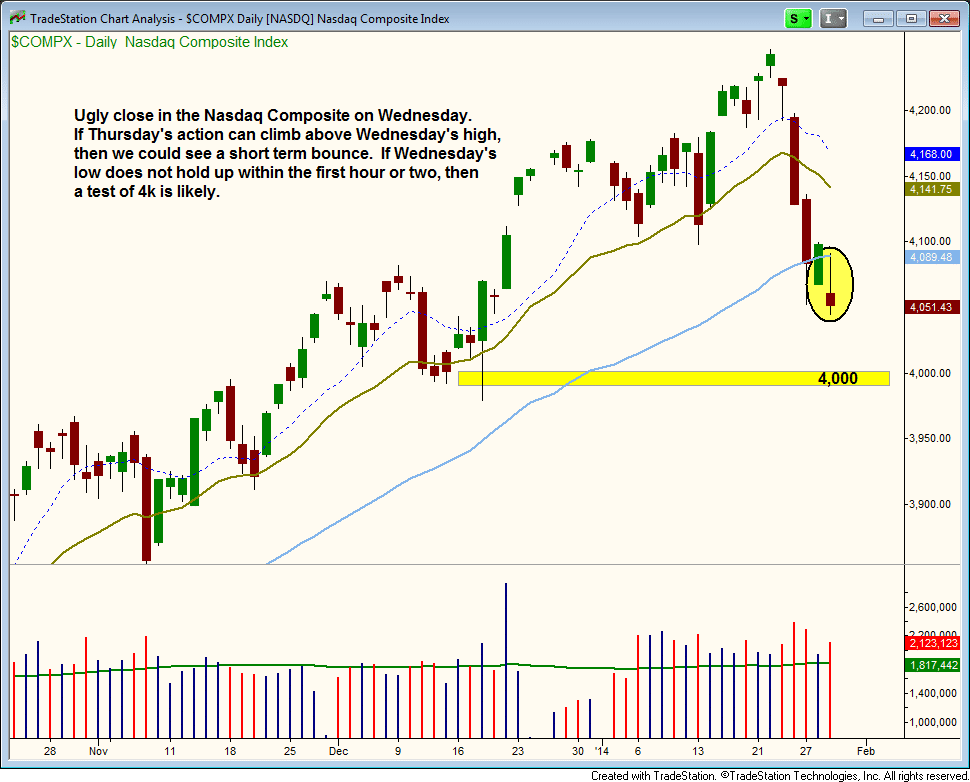
NASDAQ 4000 – Coming Soon?
Taking an updated look at the daily chart of the NASDAQ (below), notice the tech-heavy index reversed lower after running into new resistance of its 50-day moving average yesterday (January 29). The index also closed near its intraday low, near the intraday low of January 27 (near-term support).
If the price action follows through to the downside today (January 30), then bearish short-term momentum will likely take the index down to the 4,000 area (support of the December 2013 lows). However, a false move lower in the first hour of trading that subsequently reverses above the previous day’s high could lead to a short-term bounce:
Although my swing trading newsletter is not yet in full “sell” mode, I have been laying low (in “neutral” mode) this week. But as a bonus, a positive earnings report from Facebook ($FB) has currently launched our existing long position to an unrealized gain of approximately 27% since our December 2 buy entry.
The long side of the stock market is all about low volatility and steady/reliable price action. However, current conditions are quite volatile.
Therefore, even if I spot new bullish setups on the long side of the market (such as $AMBA or $AL), the stock market is simply too unstable right now to add new exposure with confidence.
Trade What You See, Not What You Think!
Obviously, there are quite a few scenarios that could play out from here, and that is why we always shy away from predicting market action and worrying about where the major averages will go.
Consistently profitable trading is all about reacting to price action, not predicting it. I can discuss different possibilities and have a plan in place, but I still have no clue what will happen tomorrow.
If my timing model shifts into full “sell” signal, I will then start focusing on short selling stocks and ETFs with the most relative weakness.
Nevertheless, with the market already down sharply in such a short period of time, there are simply no low-risk short entries at the moment.
Chasing on the short side can be just as bad or worse than chasing longs. If you have ever been caught in a short squeeze, you know that the price action can explode higher for several days before taking a break.
With the very real possibility of a significant correction just around the corner, this is a great time to review my preferred strategy for entering new trades on the short side. Upon doing so, you will surely see the importance of maintaining discipline and patience right now.Comment
-
Why Global X Uranium ETF Is Poised For A Melt-up ($URA)
With our market timing model remaining in “buy” mode, our current focus primarily remains on leading individual stocks.
Tesla ($TSLA), for example, is now showing an unrealized gain of 68% since our December 31 buy entry in The Wagner Daily newsletter. SolarCity ($SCTY) is similarly up 56% since our December 19 buy entry.
However, despite strength in leadership stocks, we have also been noticing a stealth sector rotation of institutional funds flowing into various commodity ETFs.
One such ETF we are stalking for potential buy entry in the coming days is Global X Uranium ETF ($URA), which is shown on the weekly chart below:

$URA blasted through the high of its prior trading range and 40-week moving average, on volume that was about 400% greater than average. High volume on a breakout is important because it confirms the presence of institutional accumulation.
Additionally, $URA closed near its high of the most recent week. The 10-week moving average crossed above the 40-week moving average as well, which signals a bullish reversal of trend is under way.
Since breaking out above its recent highs on heavy volume last week, the price has been consolidating for a few days on declining volume. Lighter volume during bullish consolidations is positive because it indicates the sellers are not stepping in while the bulls take a rest. This can be seen on the daily chart pattern:

From here, we now expect about five to ten days of sideways action before $URA resumes its uptrend. Zooming into the shorter-term hourly chart interval, we see the price action is holding above the 20-period exponential moving average:

As detailed in my book, Trading ETFs: Gaining An Edge With Technical Analysis, the 20-period exponential moving average on the hourly chart is usually the first legitimate support level on a pullback after a strong breakout.
The strongest breakouts will hold support at the 20-period exponential moving average and then push higher. But if that moving average fails to hold as support, then a touch of the 10-day moving average is the next logical support level.
Because of the confirmation through multiple timeframe analysis, we are now stalking $URA for potential swing trade buy entry.
Regular subscribers of our swing trading newsletter should note our exact entry, stop, and target prices in the “Watchlist” section of today’s report.Comment
-
My Analysis & Plan For Trading The Current Stock Market Pullback
At the close of trading on March 21, our rule-based market timing model shifted from “neutral” to “sell” mode, after previously slipping from “buy” to “neutral” mode on March 12.
When the timing system first enters into a new “sell” mode, it primarily acts as a “no nonsense,” objective way to keep us out of trouble by reminding that new buy entries do not carry positive odds of working in our favor.
In such a newly-triggered “sell” mode, we seek to increase our cash position, while also selectively shifting our focus towards trading ETFs with a low correlation to the direction of the broad market (commodity, currency, fixed-income, etc).
As a “sell” signal matures and becomes more confirmed by time and price, short selling of weak stocks also becomes part of the trading plan, but for now it is still too early to enter new short positions for momentum swing trading.
Static Cling Of The 50-Day Moving Average
Despite weakening performance in leading stocks and recent broad market distribution (higher volume selling) that sparked the new “sell” signal, it’s important to note that both the S&P 500 and Dow Jones Industrial Average are still trading firmly above key, intermediate-term support of their 50-day moving averages.
On the other hand, the NASDAQ Composite has clearly begun showing relative weakness to the S&P and Dow, but has yet to breakdown below support of its 50-day moving average:
On both March 24 and 25 (circled in pink), the NASDAQ “undercut” support of its 50-day moving average on an intraday basis, but still managed to close each trading session above it.
It’s a similar technical picture in the NASDAQ 100 Index (the large-cap brother of the NASDAQ Composite).
Below is the chart of PowerShares QQQ Trust ($QQQ), a popular ETF proxy for the NASDAQ 100 Index:
Since banks, mutual funds, hedge funds, and other institutions frequently utilize program trading to buy pullbacks to the 50-day moving averages, it was not surprising to see buyers stepping in each time the NASDAQ brothers neared that pivotal price level in recent days.
Biotech Blues
One of the biggest anchors holding the NASDAQ down over the past week has been heavy selling pressure in the market-leading biotechnology index.
Between just two recent trading days (March 21 and 24), iShares NASDAQ Biotech Index Fund ($IBB) plunged 10%.
More concerning is that $IBB sliced through its 50-day moving average with ease, as volume surged higher as well:
Because biotech has been one of the strongest industry sectors for many months of the current bull run, it will be important to see how $IBB reacts in the coming weeks.
While $IBB may be able to manage a short-term bounce from its current level, the technical damage has already been done and $IBB will need at least a few weeks (possibly months) to clean itself up.
Sector Rotation Keeping The Fire Burning
While leading stocks in the NASDAQ have broken down, energy and financial related stocks have held ground, allowing the S&P 500 to outperform the NASDAQ lately.
Large-cap (blue chip) stocks have recently begun leading the stock market, as evidenced by recent breakout action in energy and financial stocks.
Energy stock Haliburton ($HAL) set a new all-time high within the past two weeks, while Schlumberger ($SLB) is attacking its highs of 2011.
Even the $IBM dinosaur woke up a few days ago by ripping through major price resistance at $190 on big volume.
Base On Base Ain’t Bad
A base on base chart pattern occurs when the price action of a recent breakout is unable to extend much beyond the highs of the prior base (former resistance), but also doesn’t give up much ground.
The lows of the new base that forms should hold at or above the highs of the prior base, giving that “base on top of a base” look.
One example of a possible base on base in the works can be found in the following chart of Bank of America ($BAC).
At the beginning of the month, $BAC was close to breaking down below its 50-day MA, but has since broken out to a fresh 52-week high.
Although the breakout hasn’t been explosive in terms of extending much beyond the highs of the prior base, $BAC may simply chop around for several weeks, forming a base on base type pattern while the broad market consolidates:

Like $BAC, the Financial SPDR ETF ($XLF) also broke out to new highs and stalled out:

With $XLF, last Friday’s false breakout above the prior swing high suggests the price could be headed for several weeks of chop, which could potentially form another base on base pattern if the ETF holds above its 50-day moving average.
While it is encouraging that select blue chips are valiantly fighting to push higher with base on base patterns, you still must not forget that the recent pullback in the NASDAQ has forced the top leadership stocks to pull back to support of their 50-day moving averages.
Leading stocks like $TSLA (we are still holding with an unrealized gain of 48%), $FB (we recently sold for a 49% gain), and $KORS must hold on to their rising 50-day moving averages/10-week moving averages to keep the dominant stock market rally alive.
Most tech leadership stocks of the NASDAQ have been hit hard over the past several sessions, and will need at least a few weeks of basing action in order to produce low-risk, reliable buy entry points.
Here’s The Plan, Man!
With our market timing system (click here for an overview) in “sell” mode, our near-term trading plan is to lay low and see how the market responds to recent selling in the coming days.
If new buy setups develop down the road, we can certainly add some long exposure to our stock and ETF portfolios.
If, for example, the NASDAQ continues holding above its 50-day moving average over the next one to two weeks, our timing model could easily return to “buy” mode (especially if leading NASDAQ stocks rip higher after testing their 50-day moving averages).
But for now, there still isn’t much to do on the long side without pushing it.
Conversely, if market conditions continue deteriorating, we will eventually visit the short side of the market.
Yet, there is no need to rush into short selling right now.
Patience and discipline is the key to preserving profits in markets that are indecisive and/or in transition.
Without much effort, anyone can be a rock star in a parabolic bull market!
But what separates the professionals from amateurs is knowing when to take your foot off the gas pedal.
Clearly, right now is one of those moments.Comment
-
Nice analysis of what is going on. Thanks for your comments!Tim - Retired Problem SolverComment
-
Thanks, glad you liked it.Comment
-
Does Account Size & Share Price Matter When Buying Stocks?
Whenever I receive a question I think will be beneficial to other traders who may be wondering the same thing, I share the question and my reply with other traders.
In this post, a trader is seeking advice on how to size positions within his portfolio, and also clarification on whether or not the share price of a stock is important.
His questions are below, followed by my actual reply…
Hi,
I signed up for a 3 month stint with your company. I think it is worth at least three months to see if it fits my lifestyle. So far I like the approach you have. It is a cautious approach, which is what I need. I think the slow and cautious approach fits me well.
I wonder if someone could share some philosophies with me and maybe answer some questions?
I have been trading off and on for years so I have a decent understanding of how things work. I am not an expert. I do feel that the more money you have to invest per trade the better return you get on the investment. What I mean is that if you buy 10 shares of a 100 dollar stock, or a $1000 investment and that stock moves to $101 that is a 1% return or $10 which is a profit, but after trading fees that is a loss. However if you can invest $100,000 that same trade give you a $1000 profit. So the size of the portfolio does matter. I simply explain this to setup my questions. I know you guys understand the above.
Honestly, my portfolio for this type of investing lingers between 25K and 30K. When I apply all your rules for the size of an investment I would typically be investing somewhere between $500 to $1000 per trade. So for stocks that trade around 10 or 11 dollars per share, I get more shares and a better opportunity to make a few hundred dollars if the swing trade is positive. Things become difficult when you suggest stocks that trade at 80, 90, or 100 dollars per share. Or even worse TSLA is above 200. Which is not a huge deal if you have a larger portfolio.
Now with all of this being said, I guess I am simply looking for advice about how I should be approaching things? Or how would you approach things if you were in my position? The more money you have the easier things get, to a degree, and I do understand this. As I try to learn it helps to just hear from experts like yourselves about where my head should be at with respect to my level.
Just thinking about it on my own I have wondered if I should make two or three investments that are worth 5K to 10K a piece and approach it like that. There is more risk, but with the stop loss approach I can minimize my risk to a degree. The larger investment give me a greater opportunity to make money, but it also has greater risk. Plus with my limited funds, I can’t always take advantage of a setup you suggest.
Hopefully my minor confusion is something you can advise me on.
Thanks,
D.S.
Hi D.S.,
Great questions.
With 25-30k, you may have to stick with fewer positions to make decent gains. Maybe 4 to 5 positions at 5k each.
Key here is that you want to take on more core trades when you can, which will enable you to hold stocks longer.
You may still be able to take on a few swing trades, especially if you are not fully invested.
So, for example, with 5 positions at 6k, you have 20% positions.
Say we grab 3 full 20% positions; that will leave you with 2 empty slots. Now, those 2 empty slots can be 2 core positions at 20%…or maybe 4 quick swing trades at 5%.
So you can grab 5 full, 10 half, or any sort of mix; it is a very fluid approach.
When you have a full portfolio, you do nothing. If we stop out and you have a 20% position open, and the next trade is a swing trade with 33% size, maybe you take a 5-7% position.
And you could even take another one until a new core position comes along and you need the money.
Regarding cheaper vs more expensive stocks, it really should not make a difference [in your overall return].
Actually, if you stick with expensive stocks, you have cheaper execution cost due to fewer shares.
With a $5 stock, you would need 1200 shares on a $6,000 position (resulting in $24 round trip at a broker like Interactive Brokers that charges 1 cent per share).
For $TSLA [just over $200 per share], you would only need 25 shares, resulting in a $2 round trip commission fee.
Now, if $TSLA were to go up 20%, then your $6,000 would increase to $7,200.
Similarly, if the $5 stock rallied 20%, then your $6,000 would also become $7,200. It is the same difference [in profit].
Also, you get the added benefit of holding an “A rated” stock like $TSLA [accumulated by institutions] versus some junk stock that is cheap.
Let me know if you have further questions.
Regards,
Rick
It’s a common mistake among newer traders to shy away from expensive stocks, based on the assumption that not as many shares can be bought with a smaller account.
But as explained above, this is a mistake because it does not make a difference to your bottom line; a 20% gain on a $100 stock is the same dollar return as a 20% gain on a $10 stock (actually, slightly more due to lower “per share” commission fees).
Remember that expensive stocks are expensive for a reason — institutions are buying them (you should too).
Also, if your trading account is not yet that large, you now have some ideas on how to be flexible with regard to buying stocks.
In this case, focusing on our intermediate-term core trades may be more profitable than trying to enter all the shorter-term swing trades.Comment
-
Why Stocks Are Now Poised To Move Lower (And How To Profit If They Do)
For the past five weeks, the S&P 500 and NASDAQ Composite have been stuck in choppy, sideways ranges.
This lack of direction has caused the number of low-risk trade setups to dwindle, which is why I said in my most recent blog post that SOH mode (sitting on hands) is the best plan of action until the stock market eventually makes a clear move in one direction or the other.
Are You Ready For Action?
The good news is my top leading technical indicator (explained below) is strongly hinting that stocks may finally be ready to make a significant, definitive move in the coming days…to the downside.
But if stocks are ready to move lower, you may be wondering why that would be considered “good news.”
It would be positive news because, as a technical swing trader, you have the fortunate ability to also profit in weak markets by short selling stocks and ETFs (and any trend is better than no trend).
For traditional “buy and hold” (buy and pray?) investors, on the other hand, a resumption of the selling pressure that began a few months ago would definitely not be good news.
In this blog post, I explain why stocks appear ready to move lower, then follow-up with a brief video analysis of a few stocks and ETFs that are setting up for potential short entry in my daily stock picking newsletter.
The Most Reliable Technical Indicator In Any Market
One of the best technical indicators in a swing trader’s arsenal is volume, which is arguably the most reliable indicator as well.
Yet, volume ironically seems to be one of the least discussed indicators whenever I stumble across other traders’ technical analysis of stocks around the web.
Analysis of volume patterns in the market is crucial because well over half of the stock market’s average daily volume is the result of trading among banks, mutual funds, hedge funds, and other institutions.
As such, the major indices typically follow the money flow of institutional trading.
This means volume is a leading indicator, rather than a lagging indicator (such as moving averages).
If the “big boys” are accumulating stocks (represented by higher volume gains), the market will be forced to move higher.
On the other hand, stocks will move lower when faced with enough institutional distribution (higher volume losses).
With this knowledge, take a look at the following daily chart of the NASDAQ Composite, which shows the bearish volume pattern of recent weeks (light volume up days, followed by heavier volume down days):
The combination of the bearish volume patterns in the NASDAQ and an abundance of overhead resistance (such as the 50-day moving average), leads me to believe the next move in the stock market will be lower.
To help you make money on the short side of the market if the anticipated breakdown occurs, below is a 3-minute video that highlights a few of the best ETFs and stocks on my radar screen for potential short selling entry in the near-term.
For best viewing quality, select full-screen HD mode by clicking the rectangular icon on the bottom right of video player window:
One of the greatest benefits of momentum trend trading is the ability to profit in both uptrending and downtrending markets.
Although the model portfolio of my nightly swing trading letter has been mostly cash over the past month, I am fully prepared to profit from selling short stocks and ETFs that are rolling over and/or breaking down (assuming the NASDAQ and S&P 500 break down as well).Comment
-
The Triad Of Trading Profits – Volatility, Liquidity, & Chart Patterns
Scanning for reliable chart patterns is obviously one of the most important factors that determines which stocks and ETFs traders should buy.
However, just because a stock has a bullish chart pattern does not mean you should automatically consider buying it.
In addition to assessing overall market conditions, you must also determine if every potential stock trade also has the proper amount of volatility and liquidity.
Read on to learn how to consistently choose only stocks with ample volatility, liquidity, and reliable chart patterns (the “triad of trading profits”), which directly impacts your long-term trading gains.
The Perfect Balance
In our style of stock trading (short to intermediate-term swing), we look to trade with the prevailing trend, which is usually in the direction of the 50-day moving average.
When the market is in trend mode to the upside, it is important to expose our capital to as many bullish situations/setups as possible, in order to maximize trading profits.
To do so, we focus on swing trading stocks that are volatile enough to produce gains of 20% or more in a short period of time, which allows us to rotate the portfolio, and again, maximize profits.
Nevertheless, the process is not as simple as building a portfolio of the most volatile stocks in the market and letting the chips fall where they may.
The goal in selecting the best stocks to buy (in a bullish market) is to achieve the perfect balance between volatility, liquidity, and reliable chart patterns.
Finding The Triad
How we screen for a stock that has the winning triad of volatility, liquidity, and chart pattern reliability is actually easier than it may sound.
Volatility
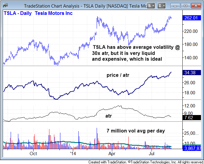
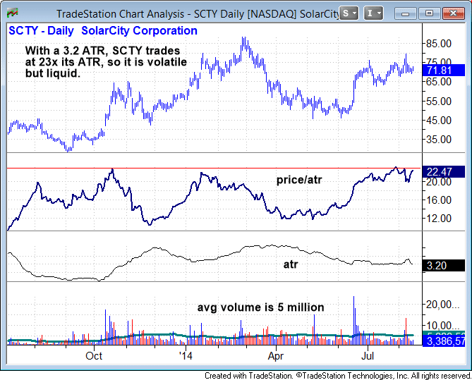
To determine the true volatility of a stock, we utilize a simple and highly effective formula known as the Price/ATR Ratio.
When using a trading platform like TradeKing or TradeMONSTER (get free trades for 60 days), we start by displaying the ATR (average true range) of a stock.
An objective, technical measurement of a stock’s volatility, ATR is calculated as the greatest of the following:
*current high less the current low
*the absolute value of the current high less the previous close
*the absolute value of the current low less the previous close
Put another way, ATR basically measures the average intraday trading range of a stock. We use a 40-day ATR, which tells us the average daily volatility of a stock, as averaged over the past 40 days.
To balance out the effect of higher priced stocks automatically having a greater trading range because of their high prices, we next divide the last price of a stock by its 40-day ATR (average true range).
For example, if a stock with a $40 share price has a 2-point ATR, it trades at 20x its ATR ($40/2).
A $40 stock with a 1 point ATR trades at 40x its ATR ($40/1).
With this ratio, a lower number indicates a more volatile stock than a higher number (which is better for momentum swing trading).
When dividing the stock price by its ATR (Price/ATR Ratio), 40-50 is roughly an average number where most stocks will fall.
However, we prefer to trade stocks with a 20-50 Price/ATR ratio.
A stock with a ratio above 60 is usually (not always) too “slow” to trade.
Conversely, a stock with a Price/ATR Ratio below 20 means the stock may be a bit too volatile for our tastes.
Liquidity
The second component of scanning for suitable stocks to trade is liquidity.
To qualify as a potential swing trade with full position size, individual stocks should trade with a minimum average daily volume of at least 1 million shares.
Some stocks we trade have far less than 1 million shares per day changing hands, but we always reduce our position size in such a situation.
Higher priced stocks are ideal, as they allow funds to maneuver in and out of trades with ease (learn why you should never avoid a high-priced stock, even with a small trading account).
Note that our requirement for 1 million shares per day is only for individual stocks; we have a much lower requirement for ETFs, as high average daily volume is largely irrelevant when trading ETFs.
Reliable Chart Patterns
The final component in the triad of stock selection is subjective and deals with spotting good-looking charts that can produce low-risk, reliable buy entry points.
Fast-moving stocks require low-risk entry points, which allow us to minimize risk and maximize the reward to risk ratio for each new swing trade entry.
This article is not about how to find the best and most reliable chart patterns, but this article will point you in the right direction for the third element of finding the top stocks to buy.
Volatility & Liquidity In Action
Based on our system, Tesla Motors ($TSLA) is an ideal stock with a Price/ATR Ratio in the 30s and plenty of liquidity:
Another solid stock to trade is SolarCity Corp. ($SCTY), which is nicely volatile with a Price/ATR Ratio of just 23:
With a Price/ATR Ratio of more than 70, Cisco Systems ($CSCO) is too slow for us and is an example of a low-volatility stock we would not look to trade:
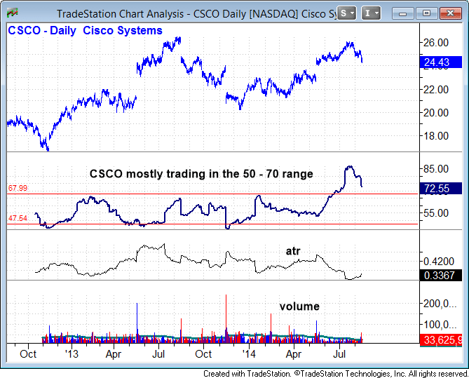
With individual stocks, we usually pass on trade setups with a Price/ATR Ratio over 50.
The ratio can be a bit higher for ETFs, which are generally slower-moving than stocks, but you should avoid ETFs trading with a Price/ATR Ratio of more than 80-90.
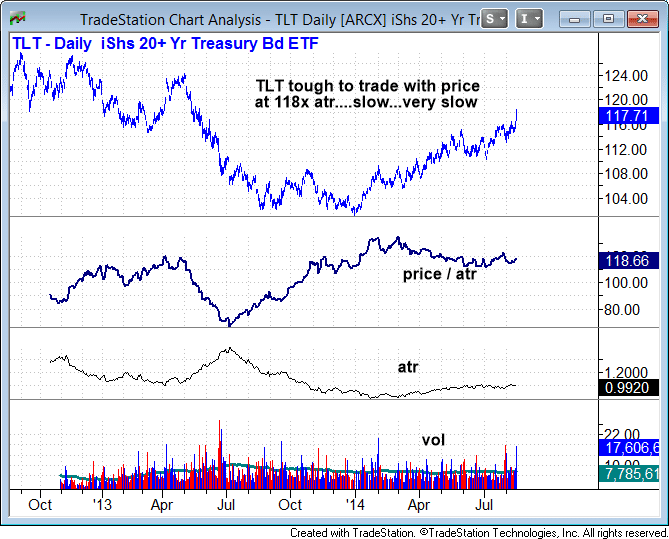
The iShares Long-term T-Bond ETF ($TLT) is, for example, an ETF we would typically not look to trade.
Although it is high-priced (which is generally good), it has a very low ATR. As such, the ETF trades at a price of 118 times its ATR.
With a Price/ATR Ratio of 118, $TLT is simply too slow to trade:
Are You Maximizing Your Potential Trading Profits?
Unless you have the luxury of a trading account with virtually unlimited funds, it is crucial to scan for stocks that provide you with the most potential “bang for the buck” (highest profit potential when they take off).
Although there may be hundreds of stocks with nice-looking chart patterns in a typical bull market, getting in the habit of checking for ample volatility (Price/ATR Ratio) and liquidity is an excellent way to further narrow down your arsenal of potential stock trades to consider.Comment
-
Here’s An Excellent Way To Quickly Measure The Strength Of A Rally
In a recent blog post, I explained and illustrated how intraday moving averages can be used to improve your stock picking accuracy.
Since I received a lot of positive feedback on that post, I penned this follow-up article to build on that mini-lesson by drilling down to focus on just one intraday moving average in particular.
This incredible intraday indicator helps you quickly and easily do three things well:
1.) Measure the true momentum of a rally in any stock, ETF, or index
2.) Remain confident when holding stocks pulling back from their highs (to reap greater trading profits)
3.) Assists you in knowing exactly where to set protective stop prices with your trending swing trades.
Want to know more?
Just read on to discover the power of the 20-period exponential moving average on the hourly chart (hereinafter 20-EMA).
Amazingly Quick and Effective Check
Over the years, I have found the 20-EMA to be an excellent tool for assessing just how bullish any rally really is (the 10-day MA also works in a similar fashion).
Simply put, it is tough to question the strength of a rally when the price of a stock/ETF/index is steadily trending higher and above a rising 20-EMA.
It works so well that I am confident (but never backtested) that you have at least a 50% chance of a winning trade if you buy a stock exclusively because it is trending higher while holding above its 20-EMA on the 60-minute chart.
Such price action shows the bulls are clearly in control.
Conversely, a slip below the 20-EMA within a rally is frequently a warning signal of a possible correction by time or price.
Shakeout Or Breakdown?
If the move below the 20-EMA was just a minor shakeout, then the price action should reclaim the 20-period EMA within a few hours to a few days, or at the very least set a higher swing low below the 20-EMA.
Smaller shakeouts will usually recover back above the 20-EMA within a few hours, which causes the 20-EMA to flatten its trend, but avoiding rolling over.
However, when volatility picks up and there is a severe breakdown below the 20-EMA (1% or more for an index, 2% or more for a stock), the 20-EMA will usually break its uptrend and roll over.
Accordingly, price action frequently becomes quite volatile, with multiple crosses above and below the 20-EMA over the next few days.
Show Me, Don’t Tell Me
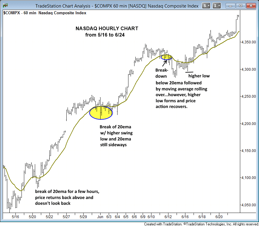
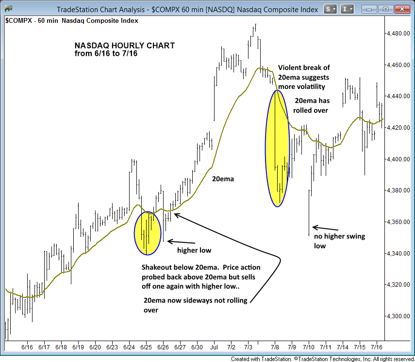
Rather than rambling on about the specifics of the relationship between price action and the 20-EMA, it is better to show you a few annotated charts that do all the talking.
Below are three hourly charts of the NASDAQ Composite, spanning from mid-May of this year to the start of September.
On each chart that shows several weeks of trading within an uptrend, pay close attention to how the price action reacts as it comes into contact with the 20-EMA:
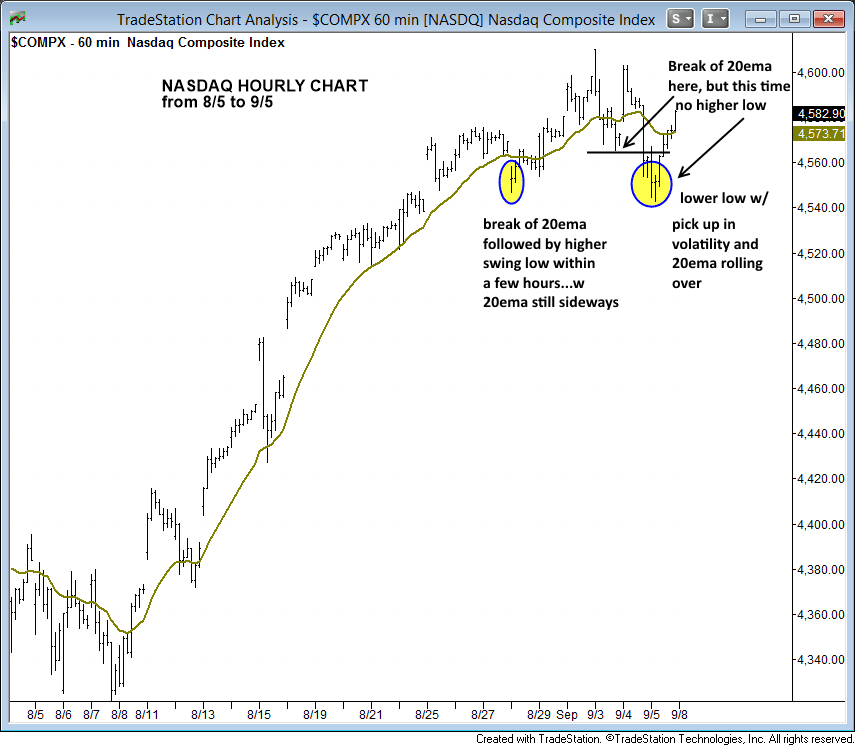
A Closer Look
When you learn how to interpret subsequent price action that follows the touch of a 20-EMA, this stellar indicator can be used by swing traders as the proverbial “line in the sand” for knowing whether or not a trend is maintaining very bullish momentum.
For example, a break below the 20-EMA, followed by sideways price action, and then a return back above the 20-EMA (while it trends sideways) is merely a shakeout that should not bother a trader who is seeking bigger gains with a longer holding period.
This type of shakeout price action is shown as point “A” on the hourly chart of Tesla Motors ($TSLA) below:

At point “B”, there is a much clearer violation of the 20-EMA, which causes the moving average to roll over as well.
Yet, if you are a swing trader looking to maximize profits, holding onto a winning position through a break of the 20-EMA is a necessity; otherwise you will continuously cut your profits short.
Even at point “C,” $TSLA is once again under pressure with a nasty break of the 20-EMA.
However, after the initial sell-off finds traction, the price quickly reclaims the 20-EMA the next day and pushes higher (which is exactly what I like to see).
Short-term Shakeouts
Whenever a stock or index breaks down below the 20-EMA and quickly finds support, the price action should snap back above the 20-EMA the next day (points “A” and “C”) OR at least form a “higher low” on the hourly chart the next day (point “B”).
Short-term shakeouts, such as those shown at points “A” and “B,” tend to last an average of just 1 to 3 days.
But if a stock or index trades below the prior day’s low (on the next day following a break of the 20-EMA) and continues lower after the first opening hour, the price action may be headed for a deeper correction that could lead to a longer consolidation period.
Another Tool In Your Arsenal
Despite my previous implication that a trader may even be able to be profitable using the 20-EMA along, you should not look at the 20-EMA on the hourly chart as some kind of magic indicator that will instantly cause you to become the greatest trader in the world.
Rather, the 20-EMA is a very helpful tool, just like several other reliable technical indicators used in the stock and ETF trades of my nightly swing trading newsletter.
Any indicator that helps remove human emotion from a swing trade ultimately increases your trading profits, and the 20-EMA on the hourly chart certainly fits the bill.Comment


Comment